Team: Product manager, frontend development team, lead engineer, UX designer teammate
Duration: 6 months
Tools: Sketch, Anima, After Effects, Jira, Invision
Challenge: The company’s IoT air‑purifier app had been live for months, but customers struggled to pair devices via Bluetooth. Support tickets cited connection failures and repeated setup attempts.
Responsibilities: Analyzed user feedback and support logs; mapped the existing pairing journey; led cross‑functional workshops to identify missing prompts; created flowcharts separating device and app actions; designed new pairing and registration flows with motion graphics and multilingual support; tested prototypes across markets.
Usability & Business Impacts
Raised device pairing success rates
Prompting users to enable Bluetooth and providing visual cues, raised device pairing success rates.
Streamlined setup & Onboarded in less time
Thanks to fewer screens and clearer instructions, shortened onboarding time.
Cut down connection-related tickets
Lowered the support costs, by reducing the connection‑related support tickets.
Higher product satisfaction
Users reported that setup felt “clear” and “easy,” leading to higher product satisfaction
Discovering the Challenge
When I joined the product team, our IoT air-purifier app had been live for several months. We heard plenty of frustration from users: “It won’t connect,” “I have to add the unit every time,” “Why does the blue light blink but nothing happens?” After digging into user feedback and support tickets, we saw a pattern: Customers were failing to pair the device via Bluetooth.
A Cultural Insight
We ran usability tests and interviews in multiple markets. In our Korean market, a key insight emerged: many people kept Bluetooth turned off by default to save battery. Because the app assumed Bluetooth was on, it silently failed when it wasn’t, leaving users stuck.
Mapping the Current Journey
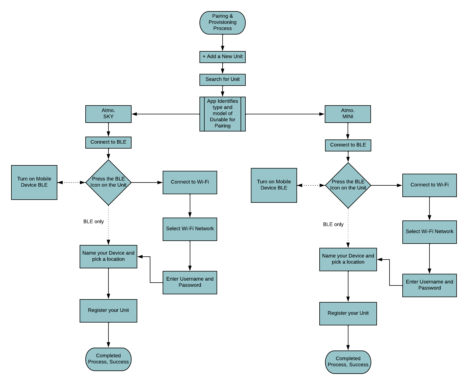
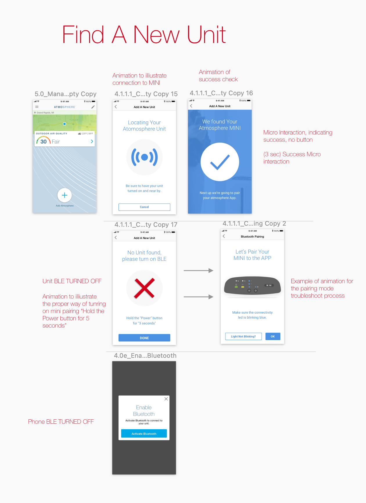
Our cross-functional team, which included two UX designers (including myself), the lead engineer, and the product manager, sat down with whiteboards and flowcharts. We mapped the existing pairing & provisioning process and realized it was not only confusing but also missing critical prompts.
We asked ourselves: Where does the user need guidance? What’s happening on the app vs. the device? How might we simplify steps? The flow showed extra waiting screens and no mention of turning on Bluetooth.
Designing a Better Experience
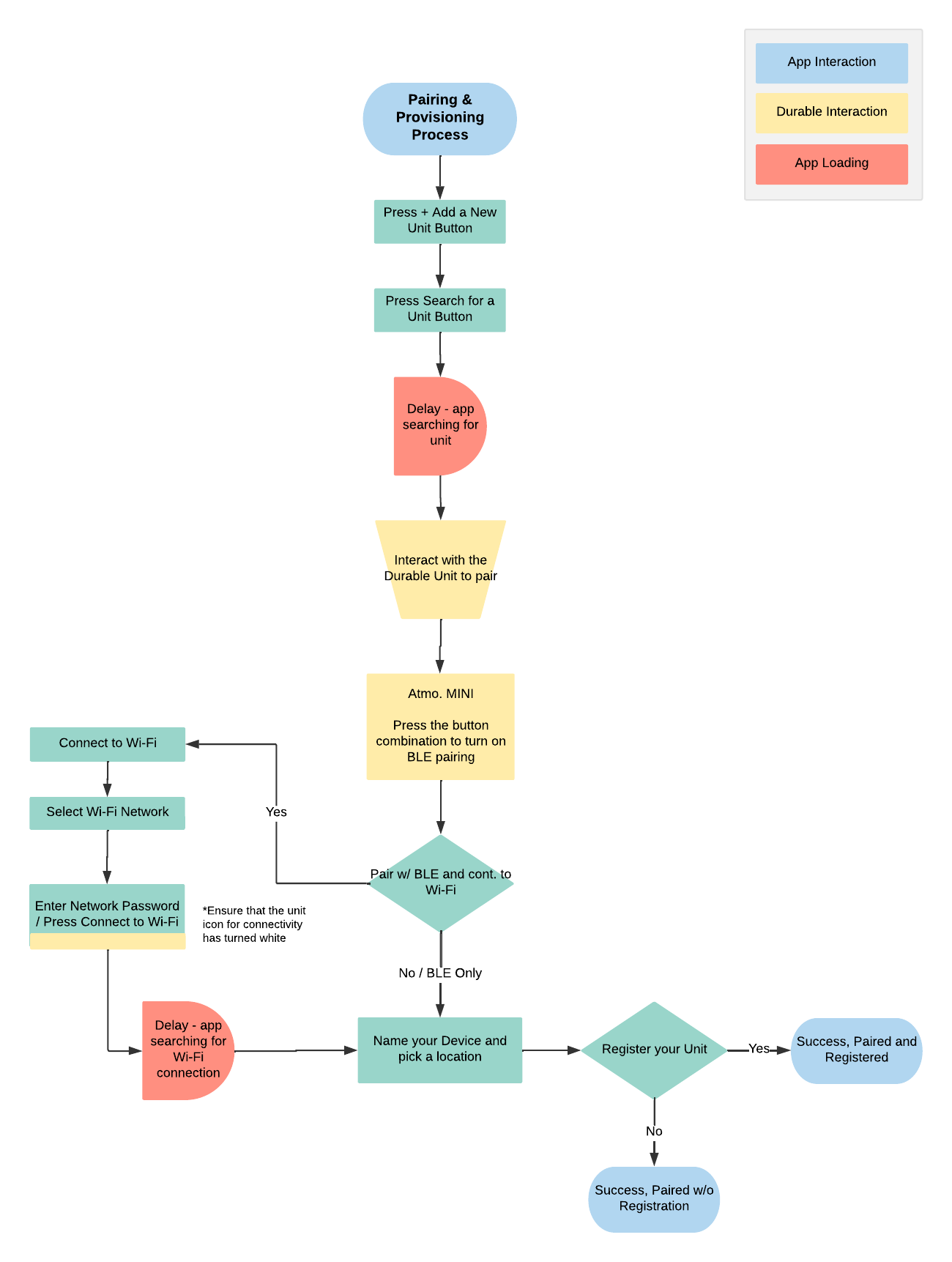
To visualize interactions, we created a second diagram separating app actions, device actions, and loading states. This helped us decide where motion graphics or messages could appear.
Key design choices emerged:
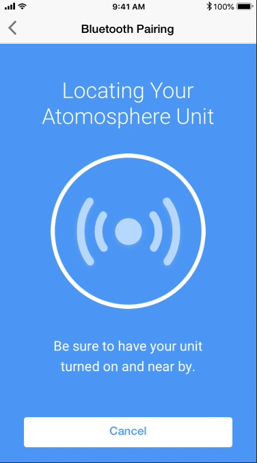
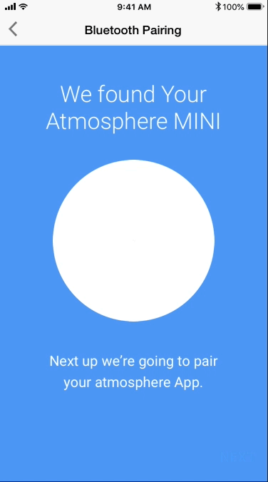
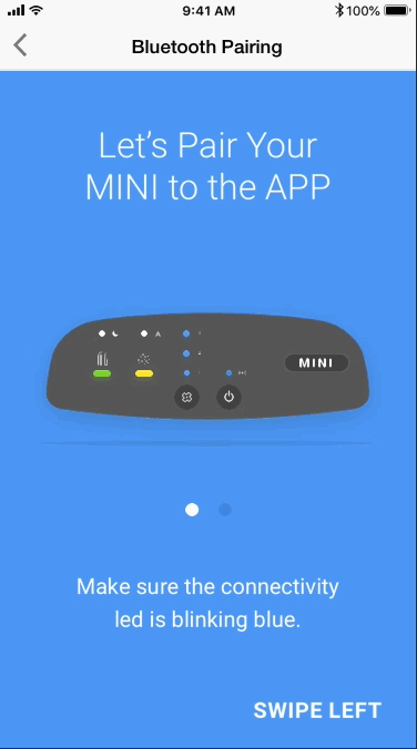
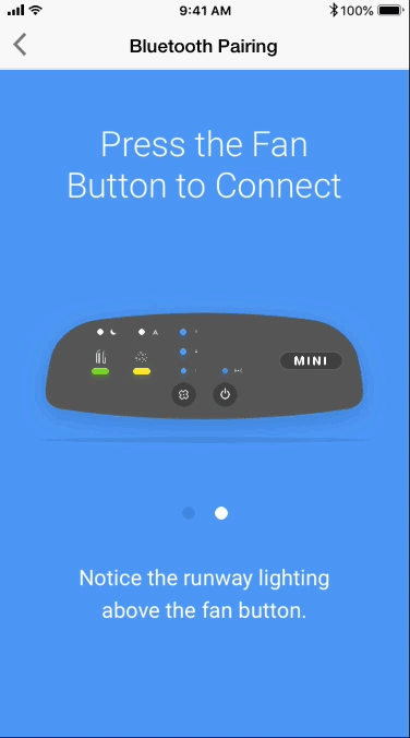
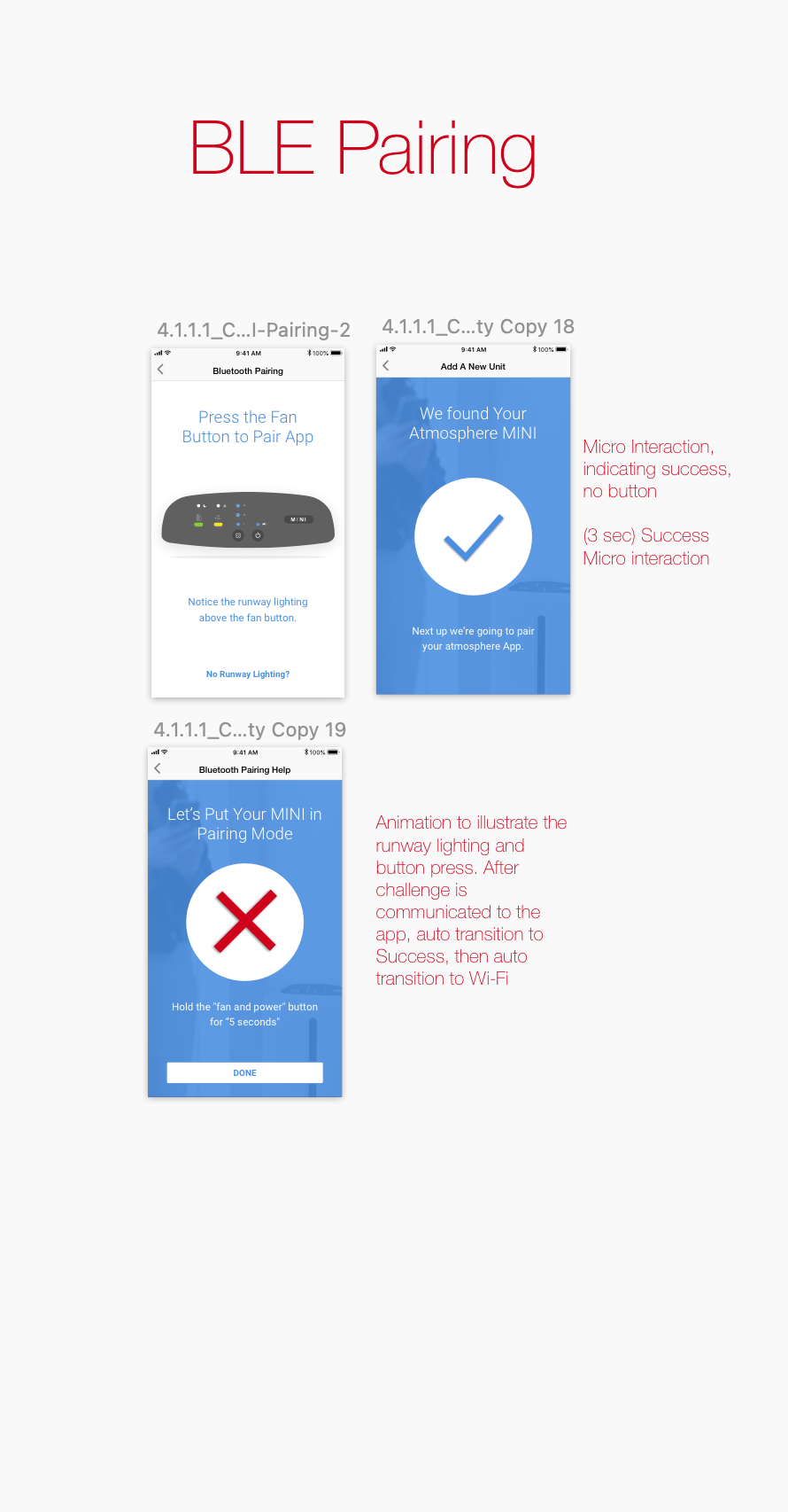
Prompt to enable Bluetooth. The app now checks if Bluetooth is off and displays an animation prompting the user to turn it on.
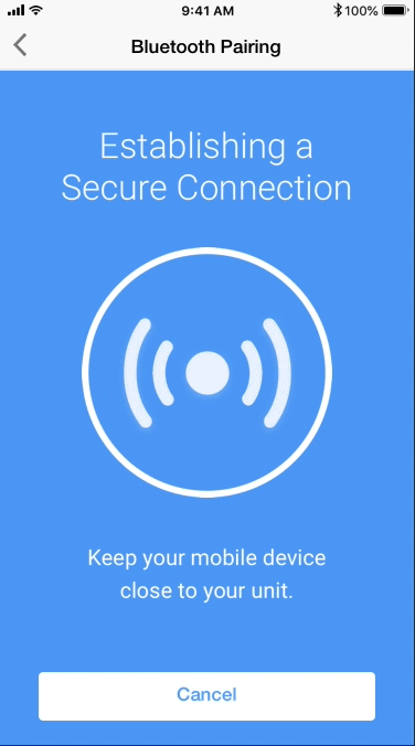
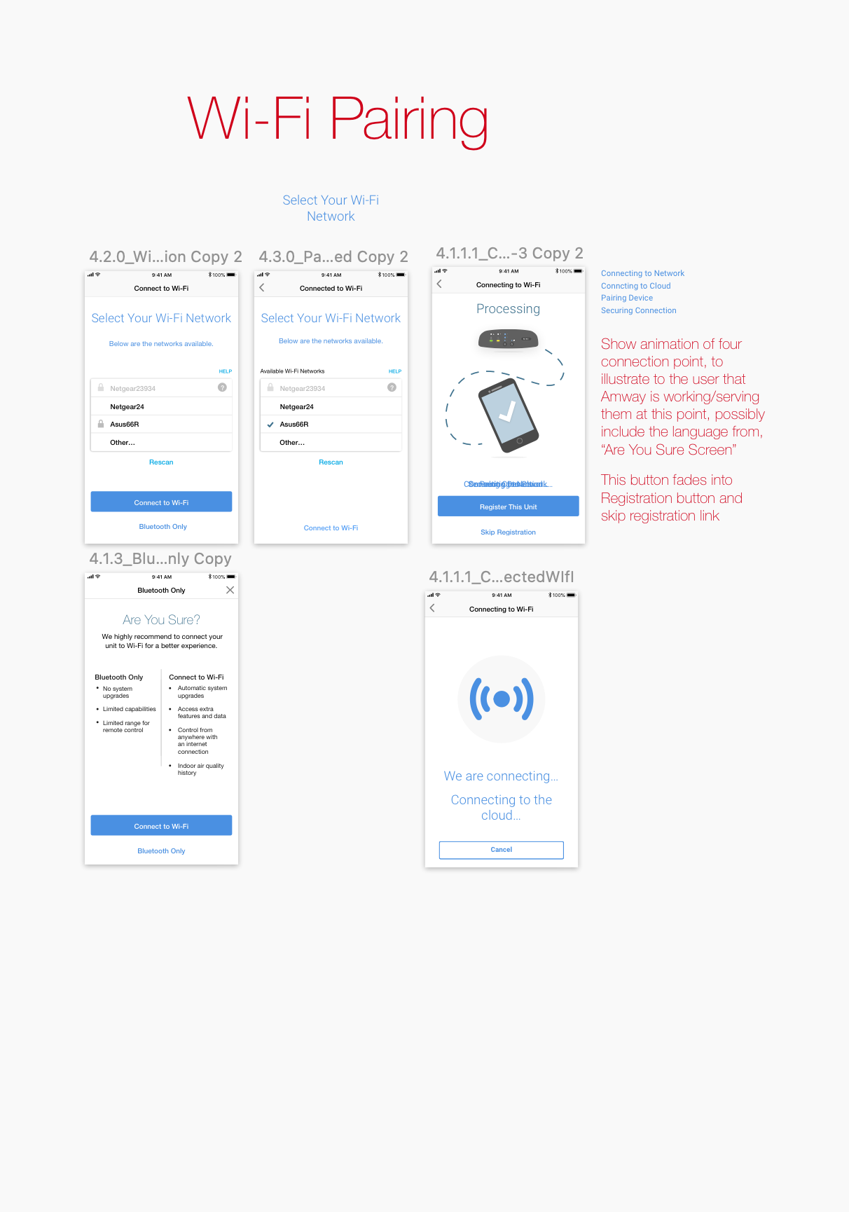
Animations during wait times. Instead of a spinning wheel, we added short statements and illustrations so users know what’s happening.
Clear instructions for device interaction. We showed how to activate pairing mode on the physical unit, using a visual that’s understandable in any language.
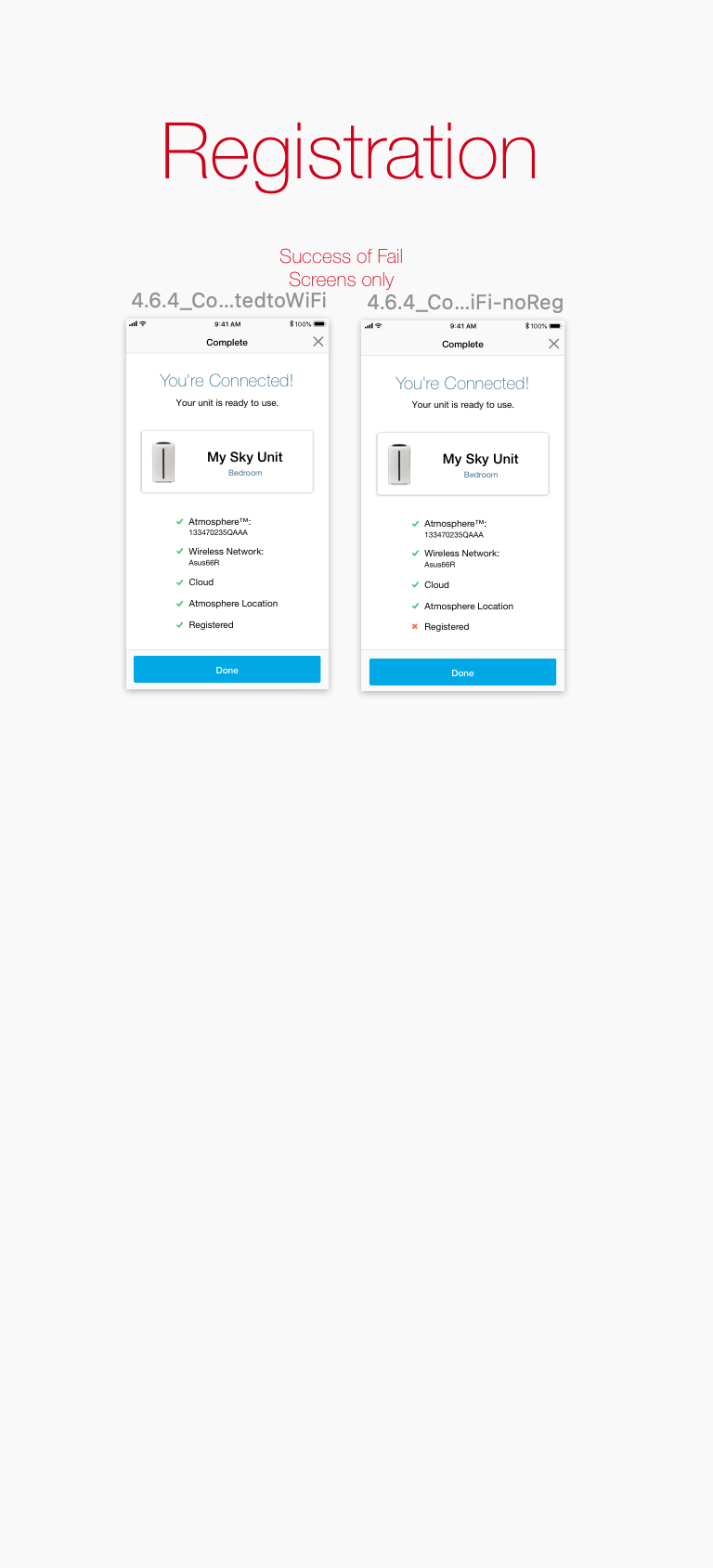
Separated pairing and registration. Registration is optional and comes only after successful pairing, so it doesn’t block use.
We iterated on the flow and removed redundant steps, like an unnecessary “Connect to Unit” screen
Bringing It to Life
Together with our developers, we built prototypes with motion and multilingual support, then tested them globally. The new flow walked users through turning on Bluetooth, connecting the device, selecting Wi‑Fi, and optionally registering. It relied heavily on visuals, with minimal text, to cross language barriers.
Results and Reflections
The redesign had a big impact:
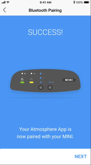
Higher success rates. Pairing completion rose dramatically because users knew to turn on Bluetooth.
Faster onboarding. Fewer screens and better prompts shortened setup time.
Lower support costs. Connection‑related tickets dropped significantly.
Better feedback. Users reported that setup was “clear” and “easy.”
This project taught me how small assumptions, such as assuming Bluetooth is enabled, can derail an experience. Our team’s mix of research, diagramming, and cross-functional collaboration demonstrated the value of investigating real behaviors and testing solutions in context. Motion graphics and clear flows helped make this complex IoT setup seamless for everyone.