Challenge: The emergency repair process was fragmented and reactive, requiring multiple phone calls and lacking transparency.
Our goal: redesign intake from the ground up and turn homeowner uncertainty into streamlined, confident coverage.
Responsibilities: Interviewed homeowners and service providers to identify pain points; mapped the end‑to‑end repair journey; developed wireframes and high‑fidelity prototypes for mobile and desktop; facilitated usability tests; iterated on booking flows, notifications and service‑provider dashboards.
Project Summary + Background
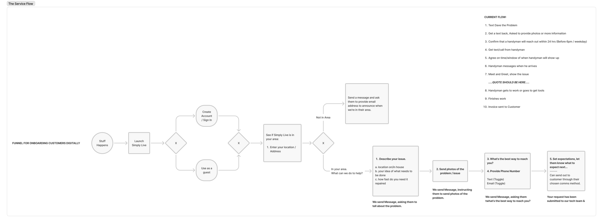
When your ceiling’s leaking or the furnace goes out, you don’t want a long form or a confusing app, you just want help. That’s what this project aimed to solve. I worked with a solo founder and handyman to design a lightweight, mobile-friendly repair request experience that felt as calm and supportive as a conversation, not a transaction.
Simply Live was more than just a handyman service, it was a lifeline for renters and homeowners who needed fast, reliable repairs. But the process for requesting help was tangled in friction:
Customers weren’t sure how to describe their issue
Long forms added stress to already stressful moments
Many users still called, but missed calls and scattered voicemails made it easy for requests to slip through the cracks, leading to lost revenue and frustrated would-be customers
We needed to reduce friction and make asking for help feel easy, even during a crisis.
Our Goals
Simplify the service request flow to reduce stress
Make the interface feel personal, supportive, and human
Capture critical information in as few steps as possible
Design for mobile-first and voice-first experiences
The Approach
1. Listening to the People on the Other End of the Phone
Before opening Figma, I listened to real support calls and mapped the emotional arc of a service request:
Urgency →Confusion →Hope →Resolution
Every design decision needed to move users out of panic and into clarity, with warmth and reassurance.
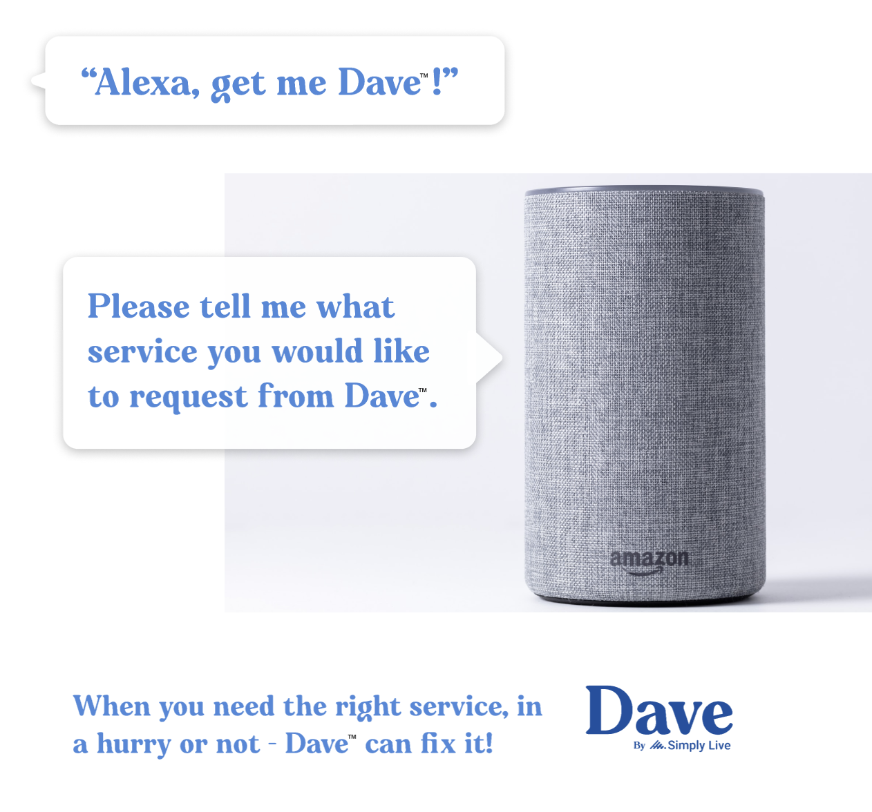
Exploring Voice-Only and AI-First Intake
To imagine a future where customers never needed to download or click, we explored a voice-first version of the experience using the Alexa platform.
The idea: speak your repair need and get help instantly. Alexa would ask a few follow-ups, confirm the address, and initiate a work request, all without screens. While it remained a concept, it served as a creative constraint: what would this process look like if it had to work without visuals or taps?
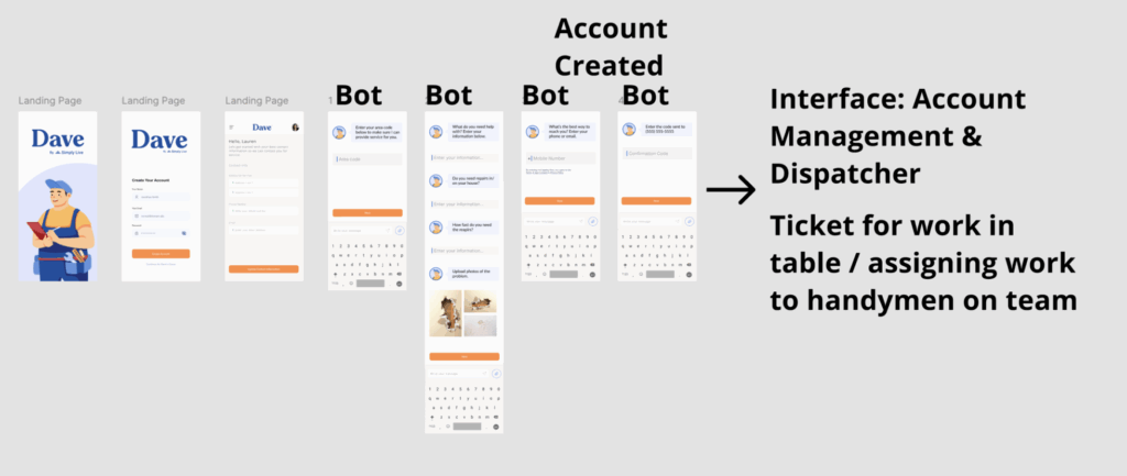
Inspired by this, we also designed an AI-powered chat intake experience for the web and mobile. Customers could message the bot as they would a friend:
“My kitchen faucet won’t stop dripping.”
“Got it! Can you snap a photo?”
The bot would walk users through describing the issue, uploading a photo, and selecting a time, making intake conversational and frictionless.
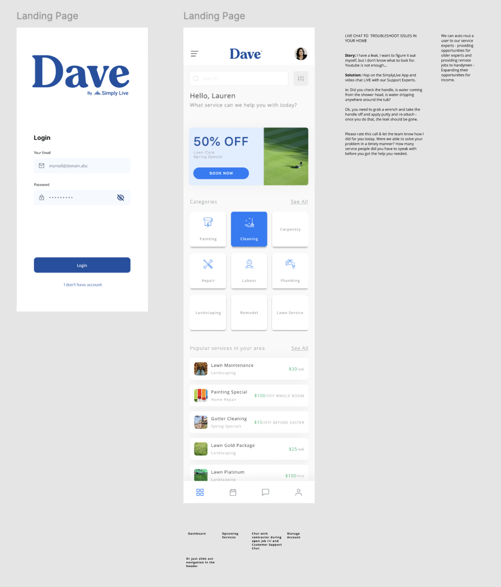
Designing for Calm and Clarity
I prototyped a mobile-first flow that asked only what was necessary:
What’s the issue? (Choose a category or describe in your words)
Where’s it happening? (Address + image upload)
When do you need us? (ASAP or future)
Each screen used plain language, calming colors, and friendly microcopy to ease tension and speed things up.
Grounding Trust in Every Pixel
The visual design leaned into approachability:
Clean layouts, rounded edges, calming color palette
Real-world icons and service-based illustrations
Microcopy that read like a friend texting you back
We avoided buzzwords and leaned into empathy. The moment the user hit submit, they saw:
“Thanks! Your request is in. We’re lining someone up now.”
Prototyping What Mattered Most
I collaborated with our engineer to prototype a simple backend that routed requests via email to SMEs. This let us keep operations lightweight and focus on what mattered most, crafting a front-end experience that felt responsive, human, and trustworthy. In moments of stress, how the product looks, feels, and behaves was the focus.
Outcomes
Although the product wasn’t launched publicly, early prototypes and user walkthroughs revealed a clear impact:
Most testers completed service requests in under 60 seconds
Compared to the original long form, participants found the new flow dramatically simpler and faster
The founder anticipated stronger mobile conversion rates and fewer missed service opportunities
Feedback from users included phrases like “ messaging makes it so easy”
What I Learned
Good UX can build calm in the middle of chaos
AI doesn’t need to be complex to be helpful, a simple conversational flow can remove major barriers
Designing for voice-first stretched my creativity as we had to prioritize clarity in messaging and dialog
This wasn’t about building a flashy app. It was about removing friction, restoring confidence, and helping people get back to normal, with tech and a little less stress.